Having worked as a web designer and UX (User experience) designer for over 7 years I like to think I have gained quite a bit of knowledge about what makes a good website. While putting together this website I have visited hundreds of small independent glamping and camping sites and come across a lot of the same problems on these. I therefore wanted to go through some of the most common errors that I keep seeing on sites, and how it could be losing you business. These are all common web designer and user experience points, but I have tried to apply them to glamping sites.
1. Make your contact information easy to find.
You would not believe how hard it is for me to track down a simple email address on some websites. All some people want to do is send over a quick email to see if they have certain facilities. If I had wanted to make a booking I would have given up. Not everyone wants to call up, as they might be in work on their lunch break, or some people just don’t like using phones.
One of the most common things is finding a contact page, but the contact form only lets me inquire about a booking. It makes me fill out about 10 fields, with dates I want to stay etc. All I might have wanted to do was to send a quick email asking about if they have certain facilities. Read this link to see how this guy got a 26% increase in inquiries by removing fields from this contact form. The website is slightly annoying with pop ups though, sorry!
During my time working at Auto Trader designing automotive dealer websites we offered short finance forms, and a large finance forms on our websites. When we looked at the stats the short contact forms got so many more submissions compared to the large one.
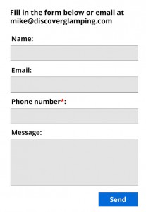
An example of a good/simple contact form
 It would be ideal to make either the phone number or email address mandatory, then if you have any issues you at least one way of getting back in touch with them.
Email address and contact form option
A good idea would be to have an email address just above the contact/booking form. Then they have the option to both send a quick email, or inquire about certain dates.
 Contact details in the header
Another good idea would be to have the contact details in the header of the website. This makes it visible on any page for the user.
 2. Location details.
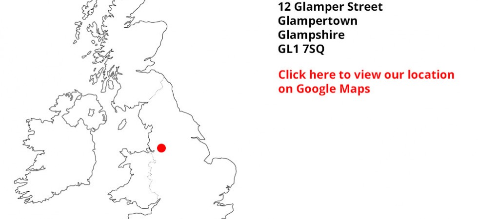
Another common theme is not being able to find out where exactly the location is. It’s fully understandable that some glamp sites do not want to give away their exact location as some like to keep their details really private, but some sites do not have any sort of address on the website. Or will simply say “we are 15 miles away from Chester” If you have no idea where Chester is, then you would still have no idea where it is. It is all about making it easier for the user, so list as much as you can without giving the location away if its private.
A good idea would be to have a picture of a UK map with a pin on. This can be zoomed quite far out, but gives the user a quick glance of where you are based. Some people don’t want to have to travel hours for a weekend away.
3. Pictures, pictures, pictures.
This is by far the most important part of any glamping site. I definitely do not want to go on a weekend away of somewhere that I cannot see any pictures of. When visiting many glamping websites I am shocked at how many do not have pictures. After all, its your business you are trying to promote so getting pictures right is crucial.
Pictures of the inside and outside. WIth my girlfriend having a bad back, she always wants to see pictures of the inside of the glamping locations to see if they have a nice comfy bed. People definitely want to see what they are sleeping inside.
Also the picture size is really important. When people go onto the gallery page they want to be able to click your images and make them bigger in size. A good choice of gallery pop up that most people are familiar with is called lightbox (example here).
An example of a bad lightbox image gallery
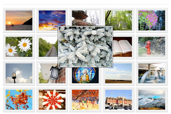 Although the gallery above allows you to make the image bigger, it still isn’t going that much bigger when clicked.
An example of a good lightbox image gallery
 The above example a nicer example of an image gallery. You can see the pictures behind the car are quite small, and then once clicked the image you want to look at is much bigger.
Photography
Photography doesn’t have to be expensive, there will be many junior photographers in the local area who will be after work for a small fee to add to their portfolio. They will know what makes a good photograph better than most of us and it would be worth paying a small fee for this.
4. A responsive website

It is more important than ever to have a website that works well on mobile. A great example of a glamp site that does this well is http://www.theyurtfarm.co.uk/. Resize your browser window and see how the website adapts to your screen size. Give it a try on your mobile as well. People will be browsing sites like this on their way home from work on the train, when they are in bed etc and if its hard to navigate and use they will click off and find another glamping site.
A staggering 40% of internet use is now no mobile phones, and in 2014 it looks set to overtake PC usage. There are some more facts about that here.
5. Do not have any pop ups
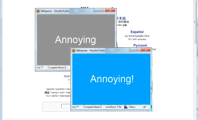
I think this is the number 1 most annoying thing for the user of any website. You get to the page you want to go on, and bang, a pop up comes up and takes over your screen. This isn’t something I have come across that often on glamping sites though. Anything that stops the user getting to the content they want will just annoy them.
6. No auto playing music or videos.
This has happened quite a few times to me while researching glamping site. A lot of people will have their own music playing on their computers while browsing the internet. The last thing they want is auto playing website music ruining their music. Have a read here about why it might be losing you customers.
7. Be personal
A nice example of an about us page is over at Camp Katur
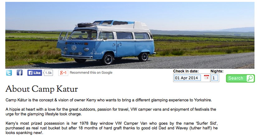 I think with most small businesses in general, not just glamping, it is nice to have an about us page telling you a bit about the owners. Maybe how they got started in the business, what inspired them etc. It just gives the user that bit more of a personal connection and lets them put a face to the website.
8. A blog and news page
A lot of glamp sites have these and its a great idea to have one of these. Not only will this create more pages automatically for your website (which is good for Google) but you can update any events you are hosting, or any features that you want to promote. If will also help you connect with your audience and they will be able to leave comments on your blog.
If you don’t have much website knowledge then you could always sign up for a free blogging service below and link off to it from your current site.
One website that is making use of a free blog service is http://www.secretcloudhouseholidays.co.uk/ who have the muddy boots blog which links off their main site – http://muddyboots.tumblr.com/ it is updated regularly with their special offers and other glamping news.
A great example of a site that has an intergrated blog is over at Yurtshire
 One thing I would say that’s really important if you do start a blog is to update it at least once a month. If you see an out of date blog it sometimes makes you think that the owners don’t bother with the website anymore.
9. Update the copyright year at the bottom of your website.
Maybe this is just me being a web geek but with any website in general if I come across the footer showing “Copyright 2010 My Glamping site” it just makes me feel like the website has not been updated for years. Even if the pictures have not been updated or nothing has changed I would go through and update the copyright year at the bottom.
10. A proper company email address.
Sometimes people might email 2 or 3 glamping sites to ask a few questions to help them decide which one to book, and I personally feel its important to use the email address that comes with your website. Rather than using randonname@gmail.com it would be ideal to use hello@glampingsitename.com. When I have emailed a few glamping sites, I get a reply from a gmail address that has no reference to their name. I have then had to work out which glamping site has replied as I can’t find a reference to it from their email adddress. It just makes it that bit easier for the user.
Which looks more professional?

11. Keep it simple – do the mum test.

One thing that I try and do with new websites that I create is write out a series of small tasks that I want the user to be able to complete easily and then get my mum to see if its easy to do. My mum is what I would class as the average web user, so she makes a good tester for this.
A good series of tasks will be things like.
- Find the phone number on the website.
- Send them an email
- Where are they based?
- How much is it for a weekend break in August
- What is nearby to do around the glamping site?
11. Have a page that lists what there is to do nearby
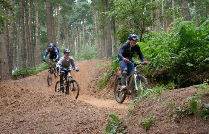
Many people that are off glamping will want to enjoy the great outdoors and will want to see whats around the local area. The glampsite might be the best in the world, but most people will want to head out and explore for a few hours. I emailed a few friends and asked them if they were going glamping what sort of stuff would they want to know about the local area. They came back with the following list that might be some useful things to add.
- Walking routes – are you near any hills and if so, what are the closest.
- Biking routes – Are there any good biking places nearby. If so, can you hire bikes there? Provide prices and links to these.
- What food places are their nearby?
- What activities are nearby that are good for children.
- The nearest towns
- How far away is the nearest shop if you run out of supplies
12. Are pets allowed?
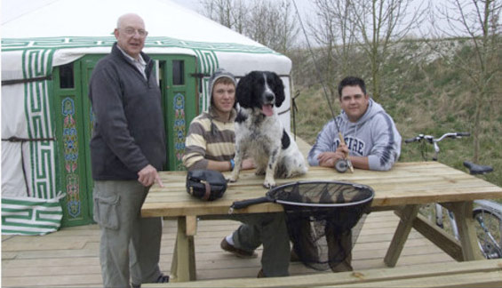
When I showed Discoverglamping to my friend who has 2 dogs. One of the first things he wanted to know was if places allowed pets. I realised I had not added this into my website anywhere and how much of an important point it is. Many people that enjoy the outdoors have dogs and will want to know if they can bring them along. If you have a sidebar on your website it might be good to add it in here so its then displayed easily on the side of each page. This is something I am looking to add to Discoverglamping.com
13. Branding
I always feel its important to have some sort of branding on the website, no matter how basic. This doesn’t have to be expensive.
There are a few places online that you can have a look at if you don’t know anyone that does logos or graphic design.
14. Professionally written website copy
There’s a few options when it comes to this that means it doesn’t have to be expensive. As I am not the best at writing so I hired a copyrighter off www.odesk.com to write all the glamping location pages. She was $10 an hour, lived in London and was fluent in English. We chatted over Skype and I explained to her what I was after and she did a great job. Another option could be to ask around your friends and family for anyone who is good at writing. Offer them a free nights stay at your glamp site in exchange for their writing services.
15. Run your website through some online tests and heat maps
There are a few websites out there that you can run your website through. These are quite easy to use and will give you some feedback on your website from random users from across the internet.
5 second test
https://usabilityhub.com

This is one of my favourites. You can sign up for a free account which allows you to run a few tests, in exchange for doing a few other test of other peoples websites. There are 3 basic tests you can do which to get some good free feedback on your website. My favourite is the 5 second test which shows an image of your website for 5 seconds and then the user is asked a series of questions about your website and you get instant feedback. The click test is also useful as it shows a heat map of where the user is clicking on your website. As a glamp site one of the main pages I guess you want people to navigate to is the contact or booking page, so you can set a test to see if they can find that easily enough. The results might surprise you, we all know our way around our websites, but this might be much difficult for users that land on your website that you think.
Summary
When looking around for a new designer to create a website, cheaper isn’t always better, the person designing their site should at least have basic UX knowledge. The main point of the website is to convert customers, it doesn’t need to WOW them (although it doesn’t hurt to have a beautiful website) but the most important aspect is to make it simple for them to find the information they’re after.
Think of amazon as an example, no one really looks at amazon and says ‘Wow what a beautiful website’ and yet its one of the most useful and visited websites in the UK. If it was full of graphics which served no purpose it would distract the user from the journey. Amazon is so successful as it is simple and straight forward. No one cares if its beautiful, but they care if they can’t find what they’re looking for.
I hope you find the above points useful, I am now off to fix up Discoverglamping and make sure that it addresses all of the points I have just mentioned above 🙂
